Friday, June 11, 2010

Project 3 - Final Model


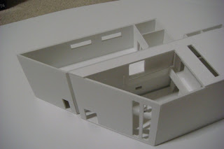
The above images shows the final model of Contemporary Art Gallery that I have designed. The model is in scale to 1:100.
I have chosen site 3 for this art gallery because I wanted to have more free space around the building, not too compact.

The layout and idea for my model is definite separate space between private and public space. By viewing from the bottom two images with the sectional cut of the model, the very bottom image shows private space in the ground level of the gallery, where the small room is the studio area with the storage room and next to the studio room there is small courtyard where people can set down and have a cup of tea/coffee, and next to the courtyard it has the owner's space. Which gives solid private space and there is a window from the owner's room where he/she can watch out the gallery while he/she is in their own room. The top part of the owner's room it has a gallery space where the artists works can be displayed and it also has the public toilet area, and it has separate space for male and female.

Looking at the second bottom image it illustrates whole public space. Starting from the lower ground gallery area, it has no windows, because I wanted to use that space for installation and also one of my contemporary artist Laura Adel Johnson uses Christmas decoration lights to compose her works, by this it need no light into the room. The above space from the ground level gallery, it's another gallery area, and it has bit more light entering from the ceiling and the back side of the building to give brighter mood in the second level. By contrasting from the ground level to upper level it demonstrates dark verse the light, but it still gives light into both room by the artists' works. The front part of the both gallery area has big courtyard which people can experience as they enter the entrance door of the art gallery.

Project 3 - 3D Perspective

This is a front view of the gallery.


This is a back view of the gallery and it has carpark at the back for customers.


This is a perspective view of exterior gallery.


This is a view from the enterance door to the gallery, the ramp leads to the first level of the gallery and the ground level of the gallery has no windows to allow no light in, because that room is used for artist's installation.


This image illustrates the top view of the enterance courtyard to the gallery.


The above image illustrates the courtyard which is between the studio and owner's room. This courtyard is used for a place where people can have a cup of coffee/tea.


The above image illustrates the long perspective view of the owner's room and on the right it has a door to the bathroom.


The above image illustrates the owner's room where the working table is and the window infornt of the desk is placed there for owner to keep an eye on the gallery even though he/she is in their own room.


The above image illustrates the owner's room.


The image above illustrates studio for contemporary artists.


One of the First level art gallery room and the doors infornt are the doors to the female and male toilets.
The images above illustrates exterior and interior perspective of designed Contemporary Art Gallery.

Project 3 - Final Drawings


The above images shows scale 1:100 drawing of Plan, Section, and Elevation.

Tuesday, June 8, 2010

Project 3 - Development towards the Final Design

Development Drawing of Floor Plan (1:200)

1:200 Model


When I was thinking about the design toward the final design for the contemporary art gallery is to have an easy flow between the rooms to the building, the simple design and layout of rooms and the lighting into the interior of the rooms and spaces.

By having a strong division of half in long horizontal way it separates the area of gallery and house and studio area, which composes definite public and private space. The doors to the exterior of different room area will act as the door and also acts as the corridor which will save the space for the building area, since we have limit area for the building size.

From the first design concept, I have left some of the ideas such as the lighting into the building, I have kept the dark spaces for the installation and artist design works that deals with lights which shines itself. And bright space for drawing and different sculpture works to be displayed.

The courtyard is included with the building which has strong connection between rooms within the building and people will have easy access between courtyard to gallery and the owner will have easy access to all different areas in this art gallery including owners own space. It has different two kinds of courtyard which has different interaction to the building. First courtyard is placed from the entrance but its surrounded by the walls and other courtyard is placed between the rooms of studio, owner's house and the door to the ground level gallery and its open on one side which will give also easy access into the building and easy access out the building considering about the fire exit.

Project 3 - Parti Drawing to Develop the Idea

This is a Parti drawing to think further about my first idea/concept for the design of Contemporary Art Gallery. It hasn't developed much but I thought about the use of light more. So on the third part of the drawing it has several different sizes of square and rectangles which will control the size and intense of light into the interior of the building. This design concept has come from Le Corbusier's 'The Chapel of Notre' building's wall windows, how it has different size of windows to control the size of light and this has been done by different thickness of walls and size of the holes.

Project 3 - Concept Design

1:200 Drawings
Ground Floor Plan (1:200)

First Floor Plan (1:200)

Side Elevation (1:200)

1:200 Model
Back View of the Gallery

Front View of the Gallery

Whole View of the Gallery without Roof

Front View of the Gallery without Roof

Top View of the Gallery

Top View of Gallery showing all the Ground Level


By making and drawing the model for this concept design helped to think more in depth about how the interior of the gallery should be lay out to compose a useful movement from room to room.

From the above image showing all the ground level from the top view illustrates the separation of the house/studio area and gallery area. But in some how I wanted to give connection between the gallery and the studio area, so on the top level of the building it has little corridor which connects the top floor gallery and the studio room which is placed on the first floor. The house area is placed just under the studio area to give strong separation from the gallery. Along the bottom side of the art gallery has office, storage, kitchen and the house.

The ground level gallery has no natural light entering into the building, the reason for this to emphasize the light work from the contemporary artists. To have the focus on their work and this part of the room for the gallery can be used for installation of the artist works. The first floor art gallery is to show more of drawings and photographs and other illustrating models with the some of natural light to brighten up the building. By this it will have contrast of dark and light to the building and also different quality of use of light, which is natural light and artificial light.

Project 3 - Natural & Artificial Light Research

Natural & Artificial Light

Sunlight, when broken up by means of a prism, is found to be composed of the colour bands of the spectrum - red, orange, yellow, green, blue, indigo and violet. These different colours represent different rates of vibration, increasing as we go from red to violet, while their wavelengths decrease. These visible rays give us sensations of light, colour and heat. In addition to these colour rays, sunlight also contains other rays not perceptible to our ocular sense and therefore invisible.

Artificial light does not radiate a complete spectrum but instead produces a light with an excess of one or more of the colour rays. In the case of incandescent lighting, most of its light is yellow, orange and red, whereas the standard "cool white" fluorescent light emits mostly yellow-green light. The various so called "sunlamps" produce either too much ultraviolet or too much infrared radiation and are definitely harmful. They may cause headaches, third-degree burns and severe conjunctivitis.


It will be harmful to have both natural and artificial light directly shinning on to the artistic work since it will destroy the original colour of the work. Sunlight will damage all the colours in the spectrum where as artificial light will damage the colour of the light bulb. So it is not good to have it directly facing the light with the work.